
by Elizabeth Picken
Ethos
From the beginning, the Saratoga Performing Arts Center (SPAC) has been a foremost cultural institution for the capital region. Drawing support from luminaries such as the Rockefeller brothers, the founding members of this organization established a past legacy and present obligation to produce quality content in a beautiful environment.
The Center plans an annual eight-week summer festival of symphony, opera, and dance at the Spa’s 1500-acre wooded park south of Saratoga Springs in an amphitheater with a maximum capacity of 5200 seats under cover and accommodations for 7000 people on surrounding lawns.
1966 SPAC Performing Arts Brochure
Before a performance can be put on, promotional materials need to be created and sent out to capture the attention of consumers, while encouraging potential audience members to attend a performance at SPAC. Starting with the inaugural season and extending up to the present, the marketing components of the management of SPAC have involved creativity and innovation. However, certain aspects of the visuals have evolved with the introduction of new technology and techniques.

Pathos
Starting with the promotion of their inaugural season, SPAC has used captivating designs in their brochures, programs, and other miscellaneous print matter. Utilizing negative space and stylized images along with minimal text, the fundraising brochure from 1966 demonstrates the limits of printing technology at the time. The use of multiple colors as a major component of printed materials did not occur until the early 1980s with USA Today as an early adopter of the trend. [1]
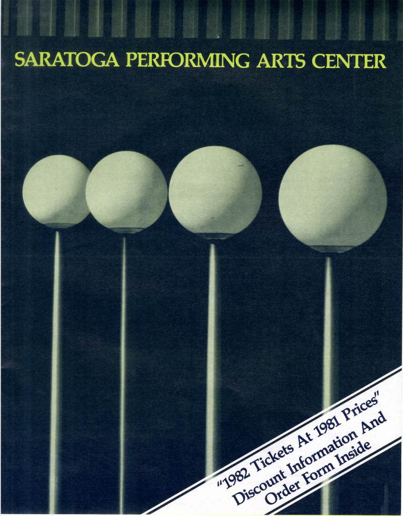
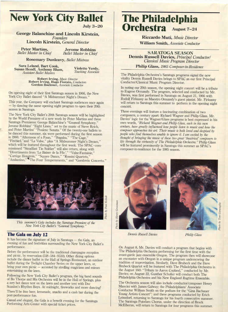
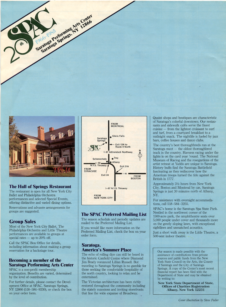
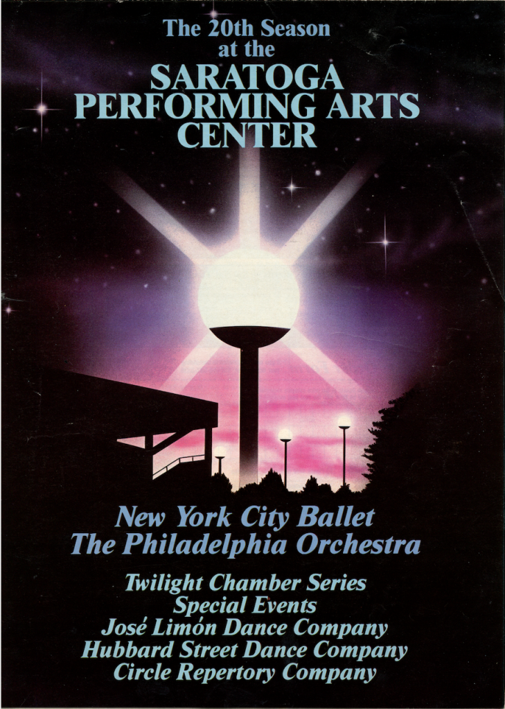
SPAC continued to use primarily black and white images with one or two colors as an accent in printed materials until the 1980s. In 1982, a brochure for SPAC’s discount series used yellow as a background color for text and black and white images, while the cover featured a color image. Brochures from the 1985 performance season show the impact of color photographs with images of performers and the venue as well as a variety of background colors for the text and a multi-hued cover design.
Logos
SPAC’s logo has also evolved over time, albeit on a slightly different timeline. Early iterations of the logo, including a geometric design by artist Charles Fuhrman, were rendered in black on a white background. [2] More recent designs – found on an event program from 2007 and the season guide from 2017 – involve the use of colorful drawings and text.
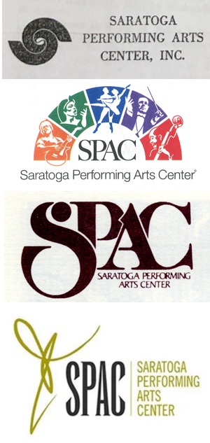
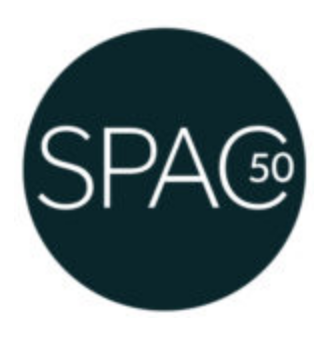
In accordance with SPAC’s current emphasis on themes of renewal and beauty, a special logo was designed for the 50th anniversary of the organization. [3] This logo, designed by Jack Hyndman, serves as an echo of the first logo. Both designs are minimal geometric images with a focus on simplicity and elegance.
Legacy
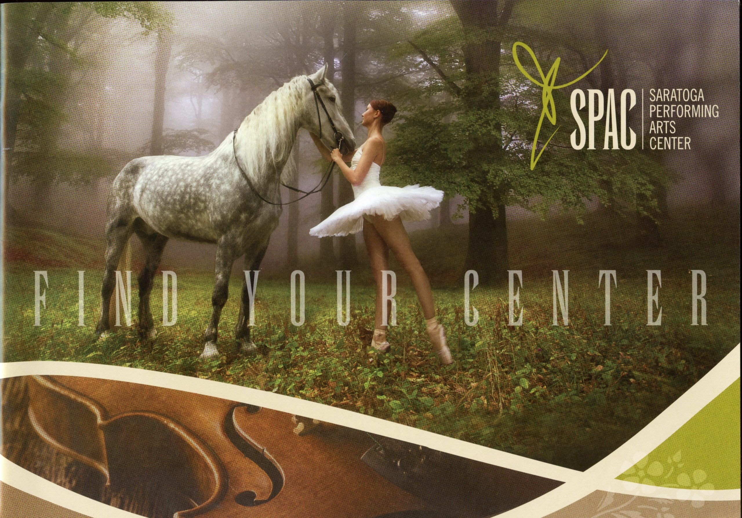
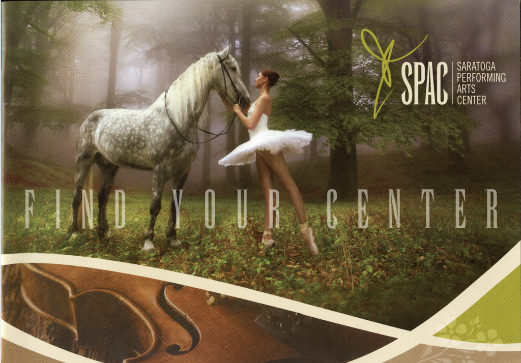
Turning to the season guide from 2017, the most recent year with materials in the SPAC Archive, it is evident that SPAC’s promotional designs have come a long way from 1966. Starting with the cover, the use of different fonts, negative space, and colorful images convey current artistic ideas and possibilities. Throughout this text, the images, text, and other design elements are unified by the guide’s theme of “Find Your Center at SPAC.”

Having beautiful performances and events throughout the past 54 years, SPAC has established a tradition for innovation in all of its activities. Its promotional and graphic design has played a major, sometimes unseen role in creating this reputation. SPAC continues to connect through social media, a newer form of marketing and design.
Sources
- William Glaberson, “Newspapers’ Adoption of Color Nearly Complete,” The New York Times, May 31, 1993, 41.
- “Saratoga Performing Arts Center,” Logobook, Logobook, May 6 2020, http://www.logobook.com/logo/saratoga-performing-arts-center/.
- “Saratoga Performing Arts Center 50th Anniversary,” Discover Saratoga, Saratoga Convention & Tourism Bureau, July 7 2016, https://www.discoversaratoga.org/blog/post/saratoga-performing-arts-center-announces-50th-anniversary-season-schedule/.
Images
Featured Image: SPAC Archive, Print Matter, 2017 SPAC Season Guide, 2017.
Image 1: SPAC Archive, Print Matter, Performing Arts Brochure, 1966.
Image 2: SPAC Archive, Print Matter, SPAC Discount Series Brochure, 1982.
Image 3: SPAC Archive, Print Matter, SPAC Discount Series Brochure, 1982.
Image 4: SPAC Archive, Print Matter, 20th Anniversary Season Program, 1985.
Image 5: SPAC Archive, Print Matter, 20th Anniversary Season Program, 1985.
Image 6: SPAC Archive, Print Matter, 20th Anniversary Season Program, 1985.
Image 7: “Saratoga Performing Arts Center 50th Anniversary,” Discover Saratoga, Saratoga Convention & Tourism Bureau, July 7 2016, https://www.discoversaratoga.org/blog/post/saratoga-performing-arts-center-announces-50th-anniversary-season-schedule/.
Image 8: SPAC Archive, Print Matter, Spring 1971 Newsletter, 1971.
Image 9: SPAC Archive, Print Matter, SPAC Reopening Celebration Program, 2007.
Image 10: SPAC Archive, Print Matter, Backstage Winter 1980 Newsletter, 1980.
Image 11: “SPAC-logo,” SPAC, SPAC, July 9 2019, https://spac.org/calendar/ticketing/rain-or-shine-lawn-tickets/spac-logo/.
Image 12: SPAC Archive, Print Matter, 2017 SPAC Season Guide, 2017.
Image 13: SPAC Archive, Print Matter, 2017 SPAC Season Guide, 2017.
About the Author

Elizabeth Picken ’21 is an anthropology and history double major at Skidmore College. She is interested in the intersections of culture and media. Having attended only one concert at SPAC prior to this class and project, she was excited to have the opportunity to learn more about this cultural institution. She is hoping to pursue a career involving her academic interests, writing, and public history.